


NYLON covers are a lot more grunge compared to the smiley faces on the cover to Teen Vogue. The facial expressions, outfits and make-up are a lot more dramatic a edgy. The reason why I am looking at NYLON is because I think it is a great example of a magazine that is attractive to both the teen and adult market. The cover's have this 'to cool for school' vibe that will entice many of those who are not wanting to conform but be different.


A lot of white space is used to give a clean and less cluttered look to the pages. Not having a set layout gives the graphic designers freedom to play about with layouts and keep the pages looking fresh and cool looking.

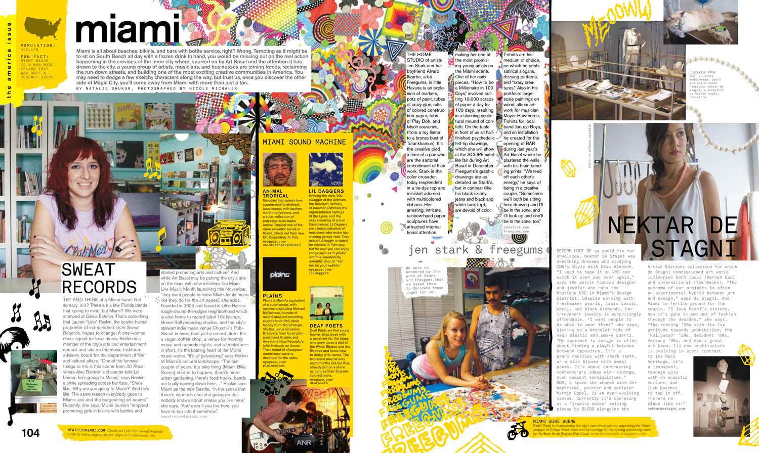
The magazine features a lot of design and music which applies to the more unique reader. The way which the pieces are laid out leave room to integrate images, illustration and bursts of bright colour. You can really get a sense of the style and how it is similar to that of the design aesthetic.


The photo shoots are much more raw and experimental with a more vintage feel in relation to the clothes and the way in which it is shot.
No comments:
Post a Comment