This project was all about creating a platform so that for Major Project I could launch Teenbook. Throughout the project I have been obtaining contact that could be useful in the future.
I have been working intently on the logo; longer than I had scheduled due to the importance - the logo will be present of everything related to the magazine from now on so it was important to get it perfect. I believe that due to all the time spent on the logo I did get a bit delayed but as a result have the perfect title to represent the brand.
Graphic designers are almost impossible to get to work for free so I have had to mock up the page layouts myself. However, I have had interest from some graphic designers who will be willing to help out once their deadlines are over and in return I will offer them accreditation within the magazine.
On my research trips to London I have enjoyed talking to teenagers on the street to ensure that I have had an accurate and unbiased opinion in my surveys.
I found the time frame of this project quite hard to work with as many of the components of my project are reliant on other collaborative projects working out.
This project has allowed me to exercise and increase my skills using InDesign and Illustrator, creating my own graphics using digital manipulation which I was then able to embed into my drawn logo designs. I feel that my technological skills are much better. I have had to use my problem solving skills to figure out how to organisational the layout for the magazine but also how to understand the mind of the 'teenager' and communicate to them.
After being in constant contact with people within the industry I have managed to establish some writers, illustrators and possibly 2 graphic designers who will be willing to help out.
Organising the whole process of Teenbook has been incredibly exciting and I am looking forward to actually lending my journalistic skills to the magazine. For the next project I hope to also launch a blog initially to compliment the magazine which will be launched before the magazine goes up for sale.
Saturday 4 December 2010
Thursday 2 December 2010
Final Layout Idea and Experimentation
Using my favourite layout designs I applied them onto the scanned images of my sketchbook. I will then pass this ideas onto a graphics designer so that they can turn these into a layout of a professional format. Currently the layouts look quite muted in colour, but once the illustration text and images are added the layout will look young and fresh.


Wednesday 1 December 2010
Creating a Press Release
Now that I have the logo I must send out a press release to media outlets to gather some attention for the launch next year. I want this press release to advertise for contributors, press enquires and start creating a buzz within the creative community. I have set up an email for all the enquires to forward to.
PRESS RELEASE
FOR IMMEDIATE RELEASE
Next year will see the launch of a new magazine for the Teen demographic - Teenbook. This magazine for the unique creative minded market will celebrate originality focusing on fashion, music, art and general musings.
Teenbook is a sister magazine to the successful Sketchbook magazine. After understanding that the youth market has changed into a technologically led culture that sees 'teens' using online methods of expressing there unique styles and ideas. Teenbook will be a inspiration point for this growing market of creative minds.
Teenbook will be available quarterly to buy online as a PDF or for delivery in March/April next year.
If you are interested in advertising, contributing or having any general enquiries please use the e-mail below.
teenbookmag@live.co.uk
Tuesday 30 November 2010
Final Logo Evaluation and Feedback
I asked Lucy to create the logo in the following colours so that I could see them in high quality. My favourite logo was the purple one and the survey showed this to be the winner too. It is bold and catches attention. I also showed the logo's to my mentor Wafa and she went for the purple; a popular choice all around.


Sunday 28 November 2010
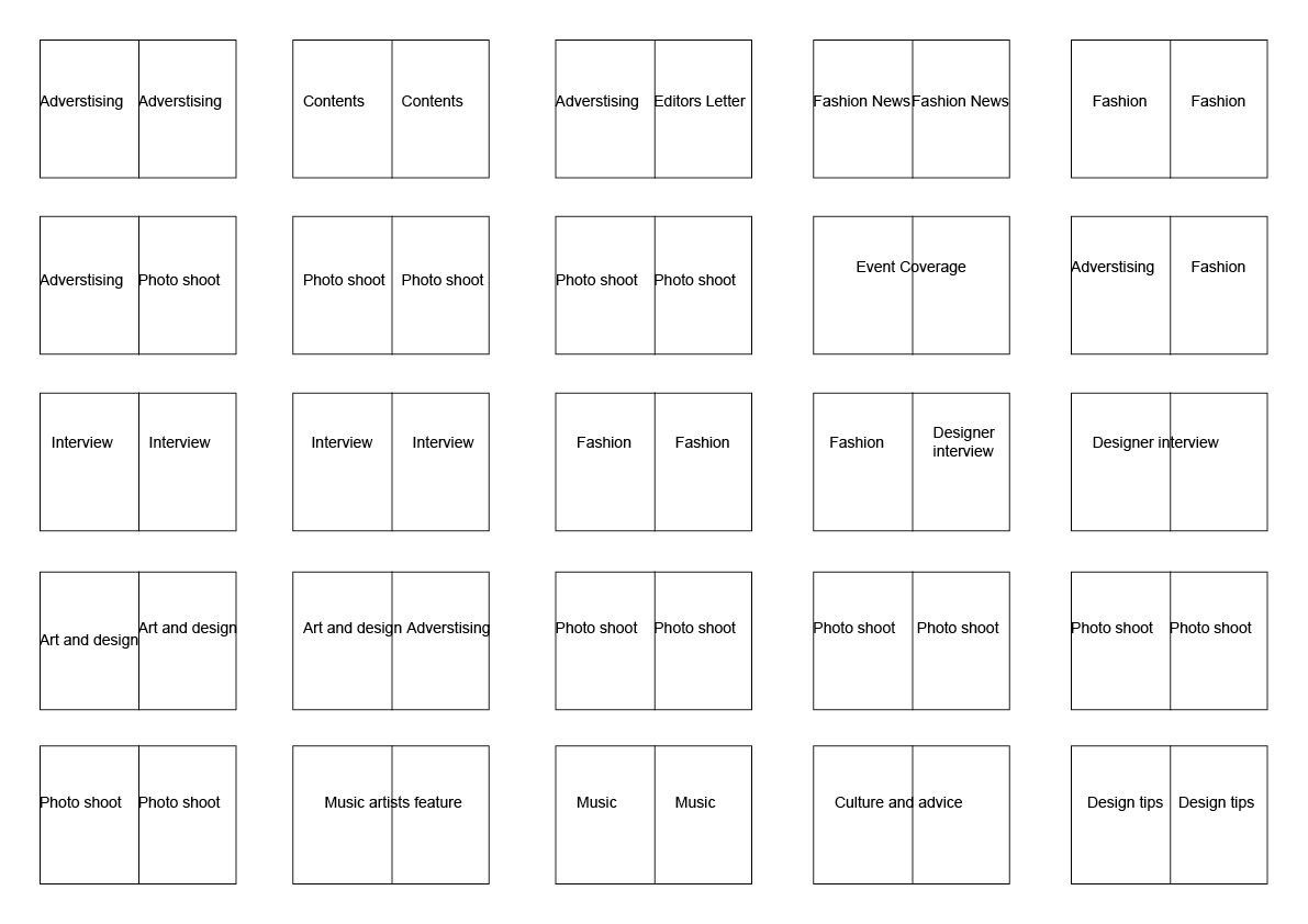
Flat Plan
This is a basic provisional flat plan of the magazine. I hope the amount of pages once the content is compiled will increase to double the amount but this depends on the amount and quality of content I receive. I also cant account for how many advertisers we have so this is an estimation. The magazine will be in A5 layout as the teen market like the more compact magazine and available as a PDF.

Saturday 27 November 2010
Possible Advertisers
In order to generate income from the magazine I have to find suitable advertisers who will be willing to pay for space within the magazine. I have complied a list of some of the brands that I think will be appropriate. Some of these brands are known to advertise in smaller more unique magazines. I have already sent out some emails so hope to hear some replies soon.
- Vitamin Water
- Urban Outfitters
- Converse
- Office
- Addidas
- Tatty Devine
- Beyond Retro
- Carnaby Street
- Lush
I will also look into some musician that may want to advertise.
Friday 26 November 2010
Feedback on Logo Design
I have narrowed down my 3 final logo colours and I asked 50 teens between the age of 13-19 to vote for their favourite.
9 votes 18%
18%
 18%
18%28 votes 56%
56%
 56%
56%13 votes 26%
26%
 26%
26%The clear winner being the purple logo with the majority of the vote and my personal favourite.
Thursday 25 November 2010
Page Backgrounds
To keep in the the nature of the 'sketchbook' style magazine I needed to find a cool sketchbook that I could use for backgrounds for the magazine. I went shopping for cool ones that had a variety of different style pages so that I have a variety of backgrounds to play with. I scanned in the pages and have squared, lined to brown paper. I can also zoom in on certain areas to give the pages a unique background.


Wednesday 24 November 2010
Experimentation with Layouts
After gathering ideas by drawing some layouts I used InDesign to mock up some ideas. I wanted to play around with not so typical layouts so in keep with the unique concept behind the magazine.


Tuesday 23 November 2010
Further Logo Development
I have been working with another illustrator Lucy Evans who I have found to create more interesting logos. I wanted to keep the book part of the logo so that people can see the link between the 2 magazine whilst still making the logo unique.


I really liked the second, fourth and seventh and I asked lucy to develop these further.

I then asked lucy to develop the third one further using bolder colours for the teen market are trying the logo using a capital 't'.


After looking at colours I decided pastels were not strong enough so I asked lucy to use some bolder colours; blue, red, pink and purple. My favourite was between the blue and the purple so I put it up on the Sketchbook Magazine twitter page to ask for some feedback but I think the purple appeals to me most.


Monday 22 November 2010
Graphic Designer Needed
I have been contacting many graphic designers but they either unwilling to work for no money or have deadlines. There is one designer who contacted me initially but I now await to hear from him. His name is Paul Taylor and I like his work because he is quite experimental with layouts.


My Chosen Illustrator
I have chosen my final illustrator out of the many that contacted me and gone with Lucy Evans. She is an illustration student at AUCB and I love that she has a range of work styles from sketchy to ink drawing. I think that she will be able to give me lots of options in terms of logo designs.


Drawn Layout Ideas
As my magazine is aimed to the more arty natured. My layout will not be the typical magazine format - when you look at the layout of NYLON magazine is it more interesting with a range of fonts and no set layout for pages. Articles look fun and engaging with the way in which they are presented, this is why I don't want to have a set layout as is depends purely on the content.


Sunday 21 November 2010
Further Development and experimentation with logo
After picking my two favourite drawn logos I decided to experiment by adding my image manipulation to it as they are in keeping with the colours I want to use within my magazine.


Using my image manipulation has given the fonts a really 'cool' looking texture. I think I prefer the font below because it is bolder and will stand out more on the page - it makes more of an impact. I like the fonts they have a sense of youth to them without looking childlike.

Subscribe to:
Posts (Atom)